VIEWPOINTS: The hidden beauty of concrete blocks: Examining NKU architecture
December 3, 2022
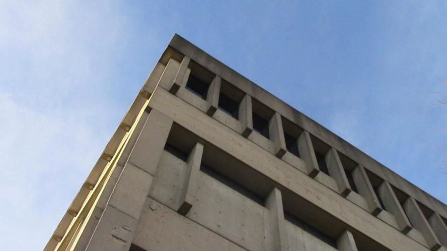
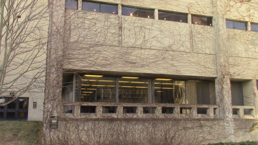
The architecture of Northern Kentucky University might not immediately strike everyone as beautiful. In fact, most people might consider it unattractive or downright ugly, when most of the campus buildings are unpainted concrete constructs shaped like boxes, dripping with unseemly water streaks in the rain and crawled over with bony leafless vines in the cold.
The general school of architecture that characterizes the first NKU buildings is twentieth century post-war modernism, which sprang from a need to rebuild infrastructure on a large scale in Europe following the devastation of the Second World War. One of the styles that emerged from post-war modernism is Brutalism, derived from “béton brut”—“raw concrete” in French—and probably the first label to come to mind nowadays when one beholds a building fashioned out of exposed concrete, glass, starkly angular geometries and minimal decorative elements.
From Europe, Brutalism quickly made its way to the United States, resulting in a proliferation of administrative and public institutional buildings in this style in the decades spanning the 1950s to 1970s. Just as quickly it fell out of favor, the imposing, monolithic appearance of its buildings came to be regarded as, well, brutal, distressing and inhumane.
Meanwhile, funding cuts and the deterioration of public infrastructure, especially in housing, led Brutalism to be associated with poverty, exploitation of the working class and urban decay. The style thus made a deeply ironic journey from a solution to resolve the need for mass infrastructure to becoming part of the problems of mass infrastructure, but it did not end there.
Brutalism has recently seen a resurgence in interest of sorts as modern-day architects come to embrace its simple honesty, proud rejection of traditions and prioritizing of the public spaces. It also looks extremely cool, as if its buildings were sculpted by aliens and not human hands, which helps spread its popularity on the Internet.
What does all of this have to do with NKU? The first buildings at NKU might have been built in the Brutalist style, befitting of a public university that started its campus construction in 1972.
NKU’s first academic building, Nunn Hall, has an unmistakably rectangular façade crisscrossed with protruding lines and rows of small rectangular windows that wrap around its contour in a display of extreme symmetry. Its overall color of faded gray looks like it can withstand and has withstood a lifetime of severe weather, because nothing can possibly make it more faded or grayer than it is now.
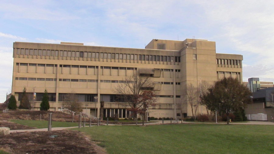
Robert Wallace, who has been teaching English at NKU since its earliest days in 1972, remembers when the campus was literally in a cow field. He also remembers not liking the architecture, initially.
“When I came I did not like the architecture. Not many of us did, because Nunn Hall was all we had and it looked like a prison. Everything was so empty around it, it seemed so very strange,” he said. “But I think the architects have done a brilliant job in expanding the campus architecturally from there.”
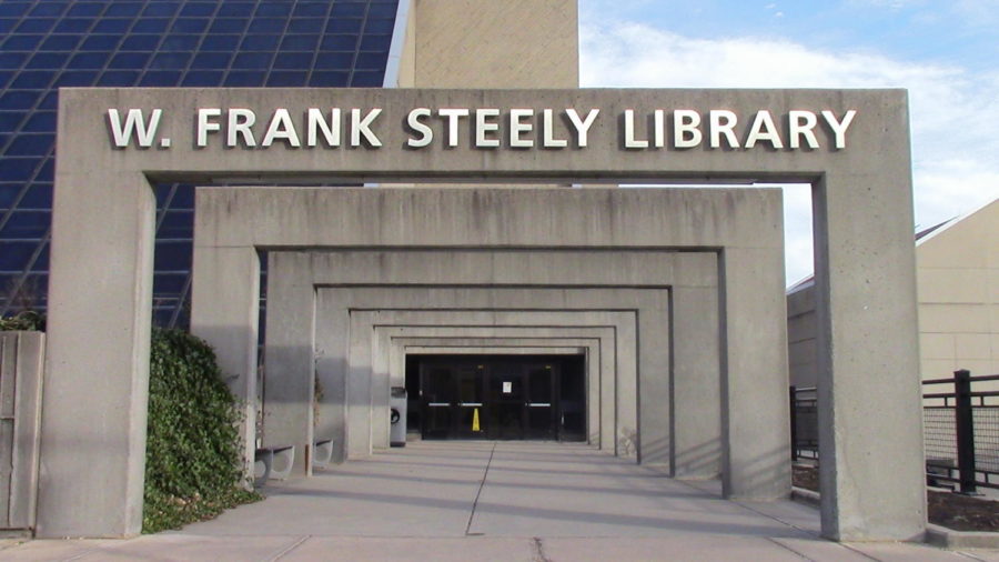
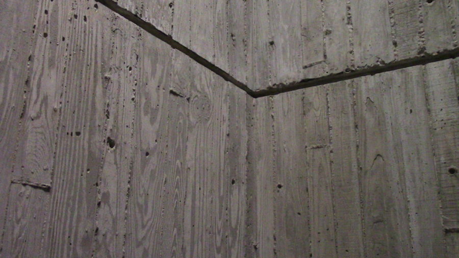
According to Thomas R. Schiff’s book “Northern Kentucky University: A Panoramic History,” published in celebration of NKU’s 50th anniversary, Nunn Hall, Regents Hall, Founders Hall, Steely Library and the Fine Arts Center were constructed continually throughout the 1970s from designs by architects Fisk, Rinehart & Hall, McAllister and Stockwell. Aesthetically these buildings have more in common with one another than the buildings that came after, in the uncompromisingly angular façades and the richly textured concrete. The walls surrounding Steely Library’s stairwells, for example, feature wood grains and diagonal patterns embedded into the concrete.
As the campus rapidly expanded, NKU also wrangled with budgetary constraints. Senior Director of Planning, Design and Construction Mary Paula Schuh said that architects and builders had to make the most out of new buildings’ every square foot, and previous architectural styles were no longer sustainable.
Nevertheless, Professor Wallace has come to appreciate the integration of the new into the original ensemble.
“At first we didn’t like the Brutalist architecture. We just thought it was so anti-humanistic and cheap and not like the typical Ivy League design of the old campuses,” he said. “That was before we built the ensemble. As soon as we had five or six buildings, I could see how they had a real plan and they were doing a lot with it.”
The most interesting aspect of Brutalism is its paradoxical nature: its aesthetics seem anti-humanistic and severe, while its original ethos is nothing but humane. At NKU, this duality plays out in the contrast between the harsh exteriors and utilitarian interiors of most buildings, where nearly every space is accessible on foot and encourages gathering. For Wallace, it is the color palette—the white of concrete walls, the red of corrugated roofs and the gray of windows—that gives the campus a sense of softness.
For all of its right angles and rough edges, NKU’s architecture blends surprisingly into the background, allowing itself to be overtaken by trees and vines. In the summer when life thrives and few people are present, the deserted campus seems almost post-apocalyptic, like nature has reclaimed it when no one is looking.
But according to Schuh, NKU did not always focus on trees and green sceneries. It was in the 1990s when the university had more funding that they started taking the landscape into consideration. Schuh recalls that when the Science Center opened in 2002, the budget included 126 trees.
“You’ll always run into budget problems on a construction project as we did on that one. We just refused to cut the landscaping budget because it was so important to us, to create that campus-like environment,” she said. “That was the big thing that was missing in the 1980s and 1970s.”
Appropriately, the Highland Heights campus is a product of its natural geography. Built on a hill where the wind can swell to frightening strengths, each building makes extensive use of the varying elevations to create entrances and exits on all directions of first, second and third floors.
This means that the campus abounds with shortcut opportunities. A skywalk bridge connects the Student Union and University Center’s third floors. An old tunnel on the UC’s first floor leads into Lucas Administrative Center’s second, bypassing the bridge and staircase outside. The stairs and amphitheater next to the Fine Arts building’s Corbett Theatre takes one directly to Greaves Concert Hall and Steely Library’s first floor entrance. The quickest way to get from Landrum Academic Center’s third floor to Griffin Hall is through the Science Center.
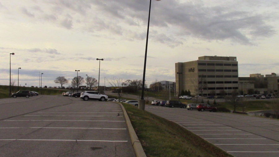
The campus was not always so walkable, and the hilly elevation makes construction expensive. Schuh described many places that are currently flat, such as parking lots, were originally valleys that were filled in with dirt. Building foundations had to be laid through solid rock. The terrain also poses a challenge to accessibility, with construction teams working hard to build ramps and curved paths along the inclines.
In the end, beyond the aesthetics and ethics of 1970s Brutalism, beyond the imposing yet self-effacing campus buildings that exist together with nature, beyond the multilevel use of space, what one feels about NKU’s architecture is a matter of individual taste. Professor Robert Wallace appreciates the soft colors and variation in geometry. Director Mary Paula Schuh holds that the campus’ relationship with its geography gives it a three-dimensional effect and interesting views from different vantage points.
And in a Twitter poll conducted by The Northerner that received 44 votes, 50% of respondents said they like the architecture, 40.9% said they dislike it and 9.1% picked “I don’t know.”
While certainly divisive, perhaps the architecture of NKU might not be so reviled after all.

